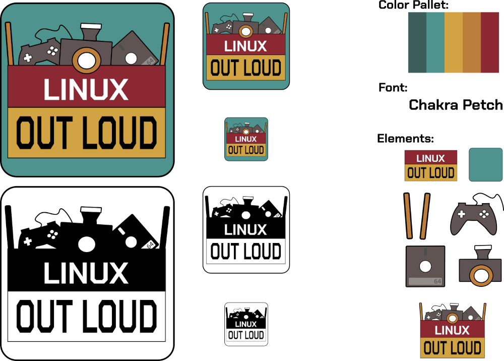
@mattdln, @CubicleNate, and I spent a lot of time looking over the logos and chatting about our favorites. We couldn’t agree on three, so here are our top two logo picks. The submissions were fantastic. We loved looking over all the creative works you sent to us. Now it is time for you to give your feedback, and help us decide on a logo.
We will be recording the FIRST Linux Out Loud on 2022-02-09T16:00:00Z. To make sure that we can have the logo ready to go for its debut release on 2022-02-16T12:00:00Z, voting will stay open until 2022-02-14T07:00:00Z.
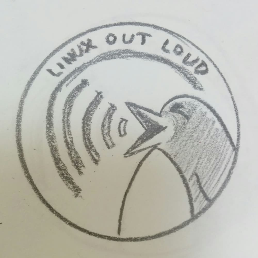
While Option A looks really pleasing and first I voted for it. But after some thinking I changed my vote, because actually I like the symbol the Option B represents. My guess is that it needs a proper translation into vector graphics, but that is secondary, as this is about the idea (in my opinion). The “speaking” or “queaking” (if that is a word) of the Tux penguin has character and matches the name of Linux out Loud.
But! As said before the Option A has this instant likeable look of it. But it is a little bit too busy. Both entries are good and congratz to both of you.
That’s a though choice indeed ! I went with option A because the Tux is used a lot to represent all that’s Linux. The loud integration is nice on option B but A seems more fresh and related to the hosts interests so it makes it quite unique.
A is a complete package. B needs converted to vector graphics (fivver) but has simplicity in its favor. I think that when the camera corner gets its own legs, parts of A will be better suited there. IMHO, if B had the polish of A, there’d be a clear winner.
Both options are really great! I commend both artists! I wonder if it’s possible or if it makes sense to combine the elements from both logo candidates into a single logo?
The simplicity of B is ideal for a logo, however, it needs to be cleaned up and some color included, it will be fantastic. A is pleasing to the eye but it is a bit too busy.
Instinctively I like B. It is simple and striking and it is deliberately vague as to whether Tux is shouting or laughing. I like that.
The font can be a little more sophisticated, but I am sure a competent graphic artist can that that concept and make it is into something very attractive and stylish.
I’ve been been looking at Option B for a couple of days and I have to say, any attempt to clean it up would ruin the art. Including the writing. It would be like a pop art version of the Mona Lisa. I’d vote to leave it as is.
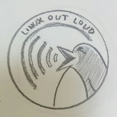
In order to just leave speculation of how it would look in a vector I just went “Fine, I’ll do it myself” and ported option B to a simple vector.
It’s not even close to perfect (as I’m not that skilled in Inkscape and made this in around 15 minutes) nor is it complete, but at least we’ll have a better idea of how it would look and now we at least have a base model to work with if it gets chosen, so here it is in all of its glory: